Design is something that is deeply important to me. Good design makes me happy and bad design makes sad. So when I heard that there was the Design Museum in London I knew it had to be on our list of places to see while we were there.
While we were first in London we went to see all the iconic sights that everyone needs to see there. But when we came back from our cruise through the British Isles, we had a free afternoon once we disembarked. We decided to use that afternoon to see the Design Museum.
How to Get to the Design Museum in London
In what is probably a good design choice this museum is simple called “the Design Museum”. It isn’t named for any person or sponsor. It is named for what it is. I add in the London part just to distinguish it from other museums dedicated to design. Since there are other museums dedicated to design, you probably want to put in the London if you are trying to get directions to it online.
The Design Museum is located not far from the Southwest corner of Kensington Gardens, so if you are planning to visit the gardens you could also stop by the Design Museum. If you are coming from Kensington Gardens you will want to exit the gate on the Southwest corner and then stay on that side of Kensington High Street and walk West about 6 blocks. You will come to another park (Holland Park). If you enter the park then you can just walk North until you see the large building with wavy roof.
If you want to arrive by underground you will go to the High Street Kensington Station. Then walk West about four blocks until you reach Holland Park. As always in London there are helpful directional signs and maps on most corners that will point you in the right direction.
What We Saw at the Design Museum in London
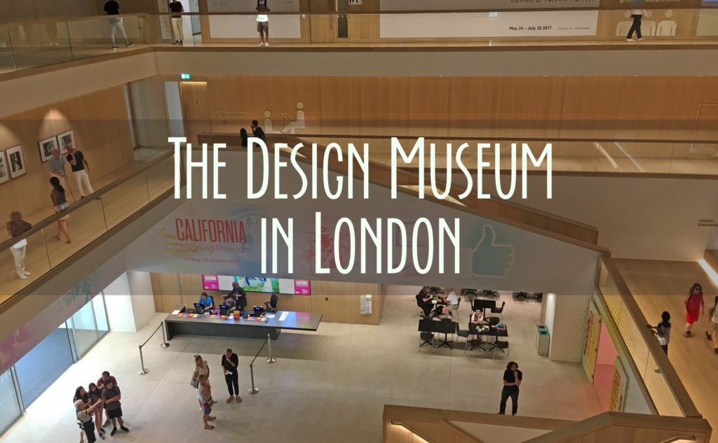
I think the Design Museum in London is impressive from when you first walk in. It has an extremely open and modern feel to it. The entry space extends all the way to the special parabola roof and a central stair takes you up to the main exhibit.
Like many museums, the Design Museum’s exhibits are always changing, so I will tell you about the three we saw. When we first walked in we were greeted by a very helpful docent who told us all about the exhibits we could see then.
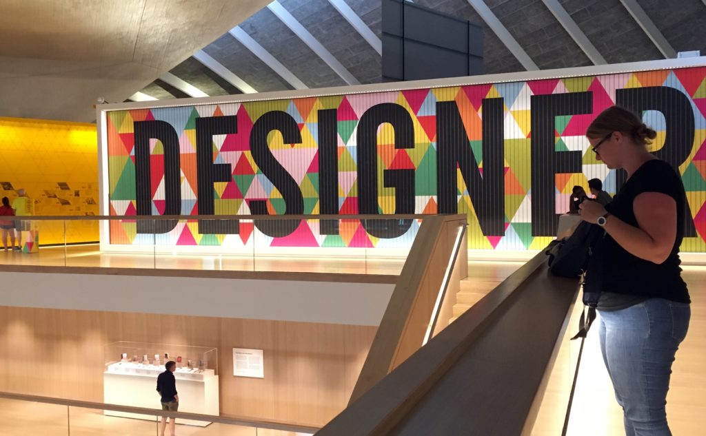
Permanent Exhibit: Designer, Maker, User
The main exhibit is dedicated to the process a design goes through. From being designed, to being made, to being used. This is a really fun exhibit, especially if you are a designer or someone who likes to learn about random things. I happen to be both, so I was in a little bit of heaven.
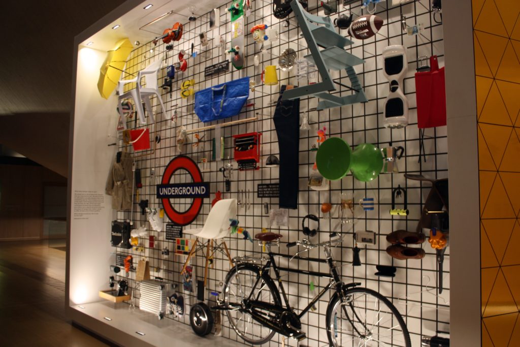
There are a lot of interesting displays in the exhibit, which is quite large. A few of our favorites were:
- The underground train redesign, this was especially relevant because we had ridden the underground for about a week.
- The interactive displays on user centered design.
- The display of Apple products (we love Apple!)
- The giant 3D printer
- The spiny chair at the end.
The Designer, Maker, User exhibit is free, so you have no excuse not to go!
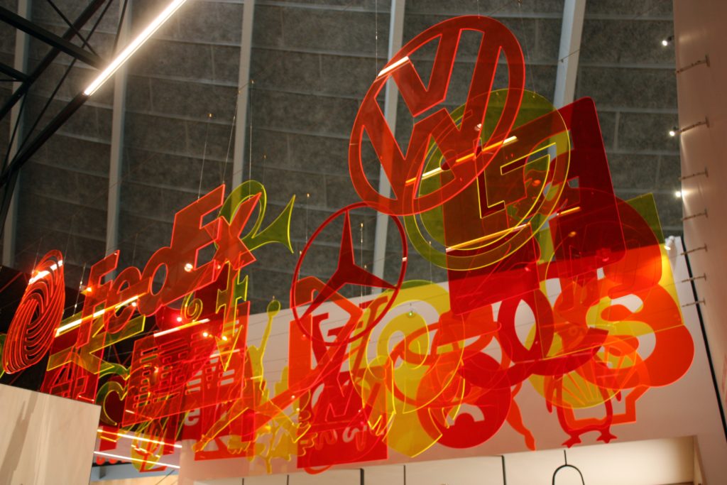

California: Designing Freedom
Note: this exhibit is open until Oct 17, 2017. So go see it while you can.
The main special exhibit while were there was, ironically, about the California design culture and how it has had tremendous impact on design world wide. This exhibit costs money, and so we didn’t plan on going to see it originally. After seeing the main exhibit though and seeing we still had plenty of time we decided it was worth it to pay to see this one.
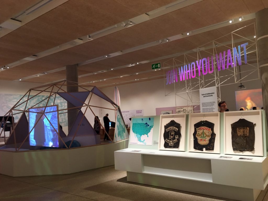
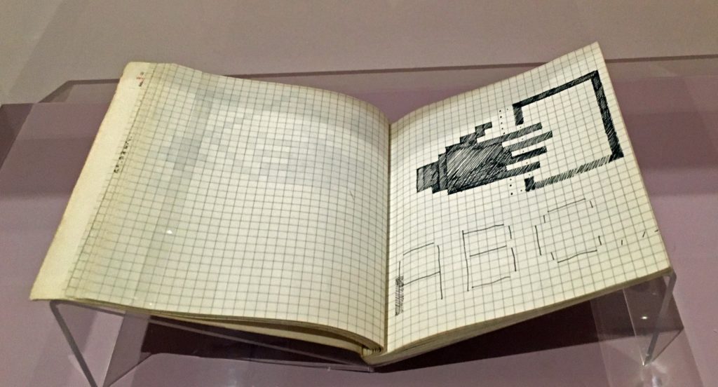
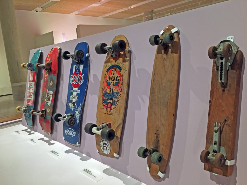
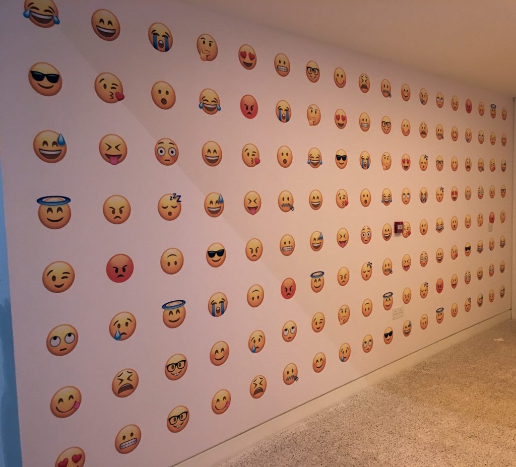
It was very interesting to learn more about the evolution of design culture in California. Of course, my favorite parts were about Apple, and seeing the evolution of the skateboard. They even had the notebook that Susan Kare used to design the original Mac icons!
Cartier in Motion
Note: this exhibit ended July 28, 2017.
This exhibit was dedicated to the work of watch designer Cartier. It was free to enter, so of course we did. While I have always worn a watch, looking at glass cases with nothing but watches in them was not all that interesting to me.
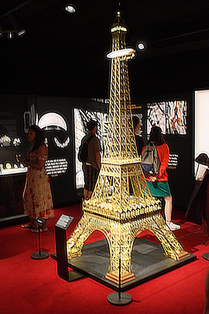
The part of the Cartier exhibit that I really enjoyed was the beginning. This dealt with aspect of Cartier’s designs that were more than just watches. Specifically it talked about his impact on aviation. Since I have recently been learning a lot about the early days of flying (remember when we saw the Wright Brothers’ first flyer?) this was particularly interesting to me.
The Design Museum did produce a special mobile app with audio info for this exhibit. So when you go you might want to check beforehand if there is an app for any of the current exhibits. The wifi in the Design Museum wasn’t very reliable, so it took quite a while to get the app downloaded and working on site.
Sum Up
The Design Museum in London is an excellent museum experience for everyone, and a must stop for those interested in design. Some of the exhibits, including the permanent one, are free. There are free bathrooms on the basement level, and a restaurant upstairs. Plan on 1-4 hours to see the Design Museum depending on how man exhibits you visit.


